In the dessert world, the cone sleeve is much more than just an outer layer or a cover for the cone. It is an excellent chance to brand, make a remarkable experience for the clients and give them an alluring feel. Cone sleeve designing has now gradually become an efficient marketing strategy where a plain paper sleeve slipped over the cone has turned into an artistic graphic design.
Now, let’s discuss cone sleeve design, the process of creating the perfect cone sleeve packaging, and why the subjective approach to make significant changes can be crucial for your brand image.
Why is the Cone Sleeve Design Important?
When customers get an ice cream cone, they focus mainly on the outer cover of the ice cream. A perfect cone sleeve which is designed not only protects the hands while handling the cone but also makes the ice cream cone look good. It has various functions in day to day life ranging from usability to identification and advertising.
Brand Visibility
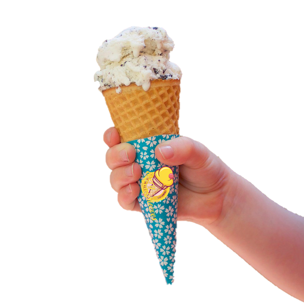
In Addition to the basic cone design, a cone sleeve can be used to carry your company’s logo or message around. As you promote your brand, your logo, favorite colors and your brand message can be imprinted on the minds of customers as they savor their ice cream.
Customer Experience
The design of the sleeve comes into benefit in enhancing the fun and jovial feelings of the consumers of the dessert. As part of a package design, a sleeve can elicit feelings and thus enhance the branding experience.
Hygiene
Cone sleeves shield the cone wafer from the touch of hand and is less personal than licks so it is more hygienically satisfying and aesthetically beautiful to customers who consider hygiene important.
Key Elements of Cone Sleeve Design
Designing the perfect cone sleeve requires attention to various factors that contribute to both functionality and aesthetics. Here are the key elements to consider:
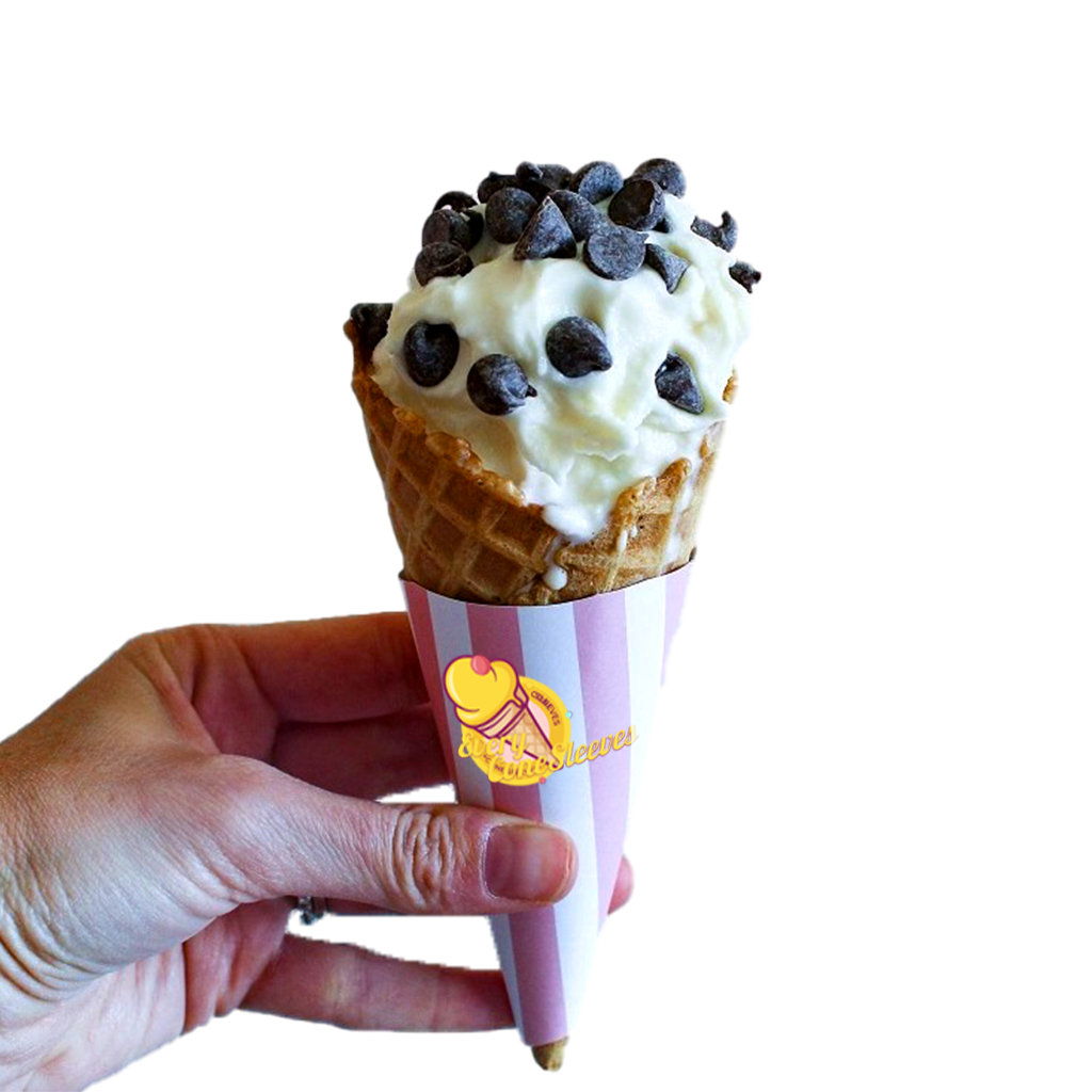
Branding
The most critical aspect of cone sleeve design is incorporating your brand’s identity. This includes the use of:
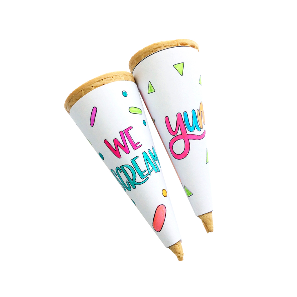
Logo: Ensure your brand logo is visible and central to the design. The logo should be prominent but not overpowering.
Colors: Choose colors that are consistent with your brand’s palette. Bright, eye-catching colors can make your ice cream stand out and attract more customers.
Typography: The fonts used on the cone sleeve should be clear, legible, and reflective of your brand’s style. Whether you choose playful fonts for a fun brand or elegant fonts for a premium feel, typography can convey your brand’s personality.
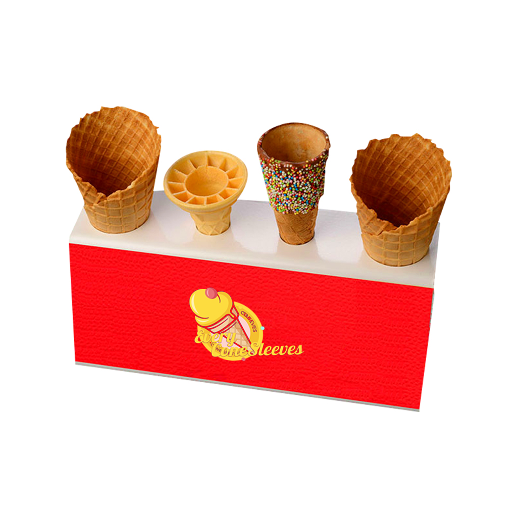
Shape and Fit
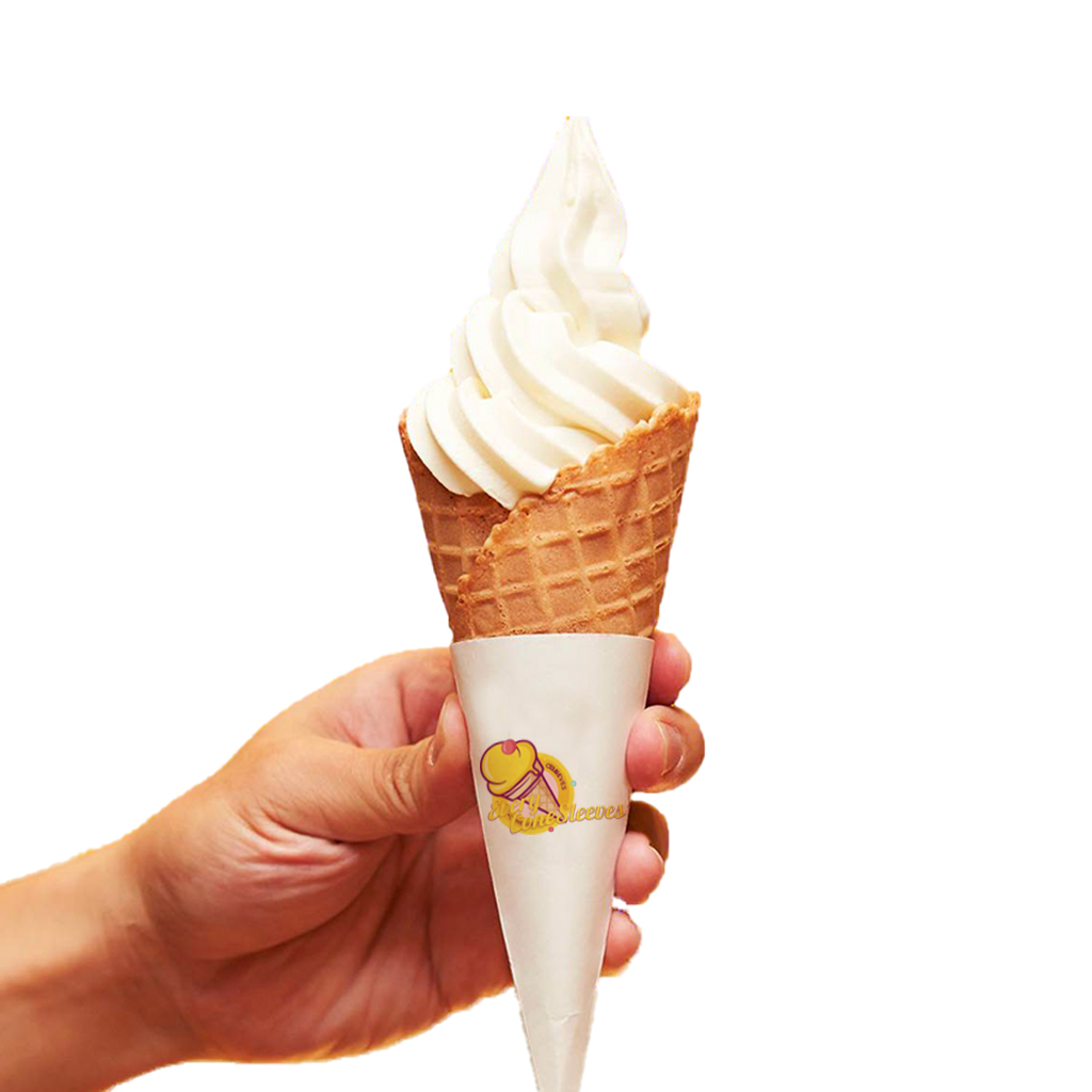
Cone sleeves come in various shapes and sizes, depending on the type of cone you serve. You should ensure that the design is tailored to fit the exact dimensions of your cone to prevent wrinkling, slipping, or tearing. A good fit is crucial for maintaining the sleeve’s visual appeal while ensuring it functions effectively.
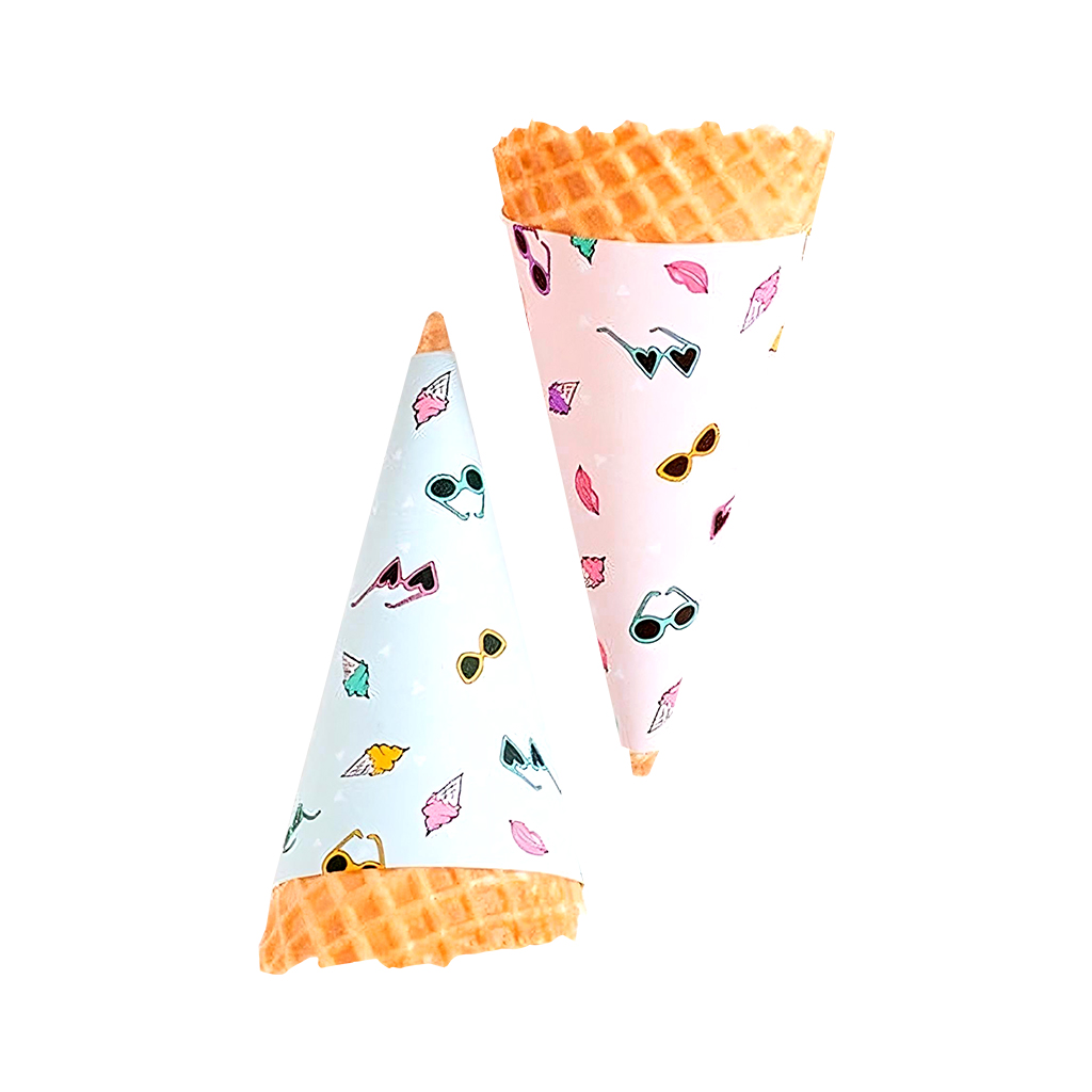
Graphics and Imagery
Incorporating illustrations or imagery can elevate your design. You could feature:
Illustrations: Fun, hand-drawn illustrations of ice cream, cones, or playful characters can add a creative and joyful touch.
Patterns: Using patterns like polka dots, stripes, or custom motifs can make the sleeve visually engaging.
Seasonal Themes: Adjust your cone sleeve designs based on seasons or holidays, such as snowflakes for winter, vibrant flowers for spring, or festive graphics during Christmas cone sleeves.
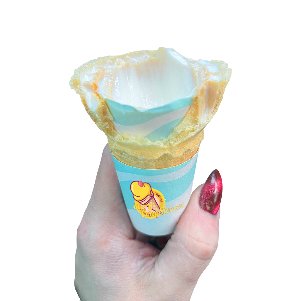
Material and Texture
Design of the cone sleeve is vital, however, the material of the cone sleeve is as equally significant. Kraft paper is mostly used for printing due to its durability and flexibility of the paper. But you can try such finishes as a glossy or matte lamination to give customers that high-end, touchy-feely feel or add an embossed logo for instance.
How to Create the Perfect Cone Sleeve Packaging?
Now that we’ve explored the key design elements, let’s look at the process of designing an ideal cone sleeve:
Understand Your Audience
However, the next question you have to answer is who is your target client? Are you making ice cream for kids or do you target niche high-end consumers that enjoy their gourmet ice cream? Knowing your audience will determine almost all aspects such as hues and shades, illustrations and slogans.
Create a Concept
The fundamental idea is that you choose a basic design that will convey your brand image. You must consider what emotions you want the customers to experience when they get your cone. Would you like your target consumers to view your product as fun, something from childhood, or something luxurious? Create rough outlines of concepts and motifs in line with the image that your brand has in your mind.
Choose the right colors and fonts
The colors and font should complement your brand and who your target audience is. Intensive colors can appeal to young people, and pale-and-bright colors – to people with an exquisite taste. The font used must therefore be quite clear, particularly where one is outlining aspects such as the type of flavor available or a promotion message.
Conclusion: Designing with Purpose
Designing a cone sleeve is a creative branding experience that encompasses the ability to wear artistic and functional designs on cones. However, it provides brands the airing ground by making strategic, artistic, qualitative, and quantitative statements on their products as well as making their customers joyfully satisfied.
Some brands even use cone sleeves as a way to popularize their items and such could only be made effective if designed well from the aesthetic point of view. Therefore, you need to consider proper design of cone sleeve packaging when you are introducing a new ice cream brand.